打開綠生活 - 視覺識別 提案
OPEN GREEN - Visual Identity Proposal
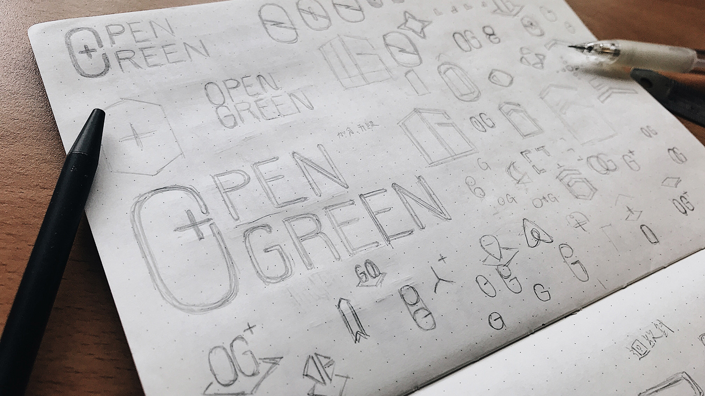
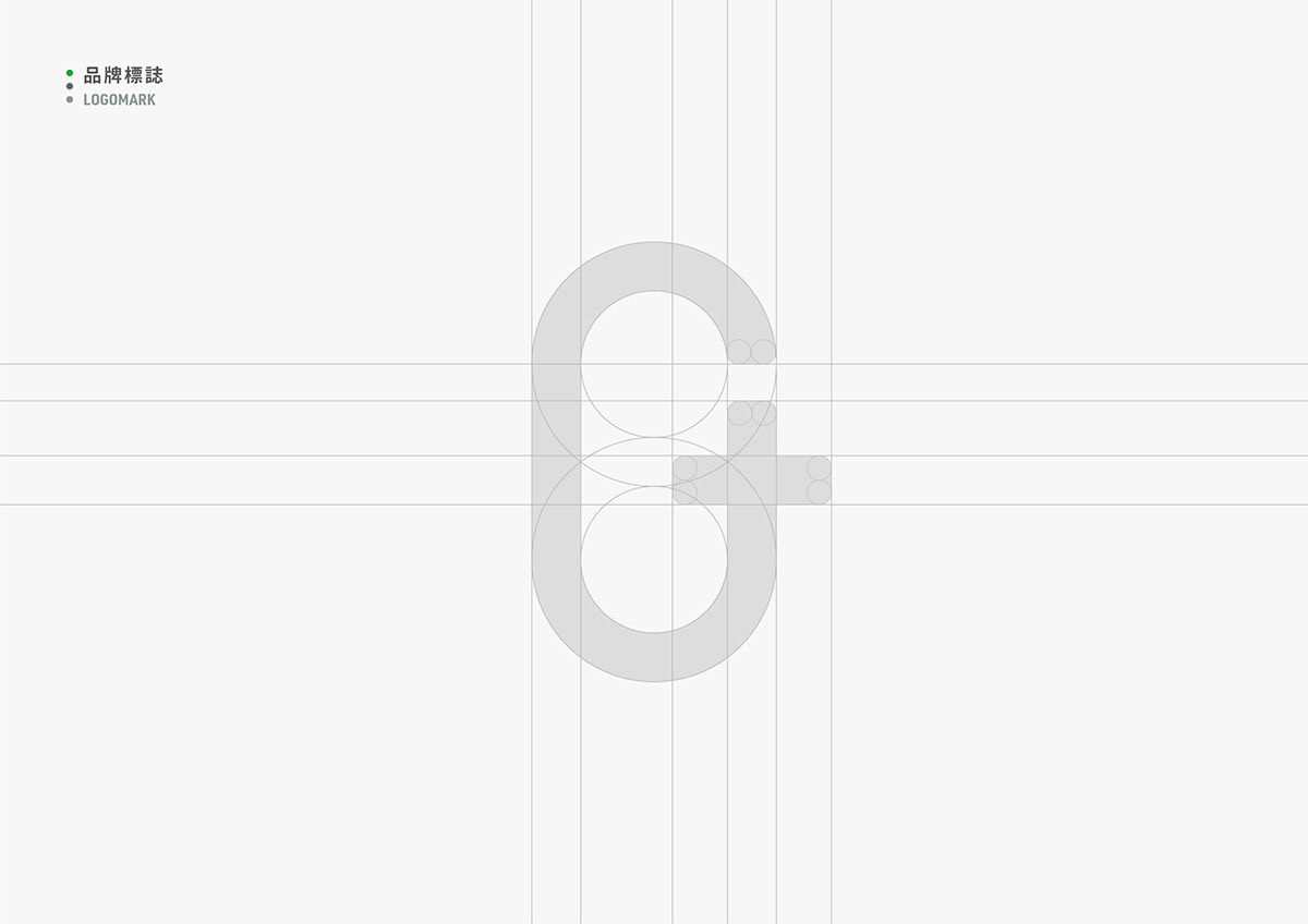
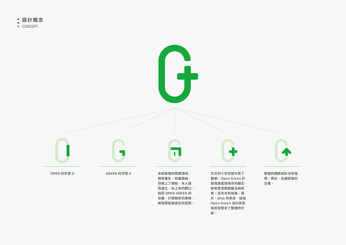
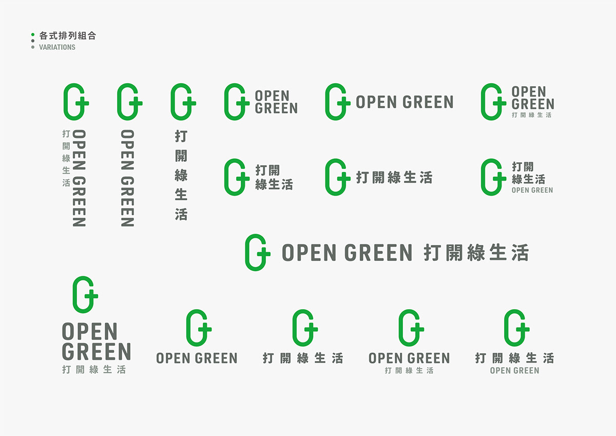
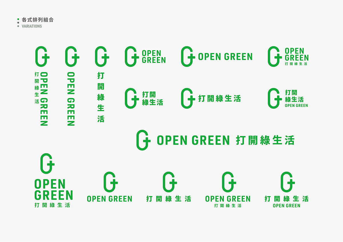
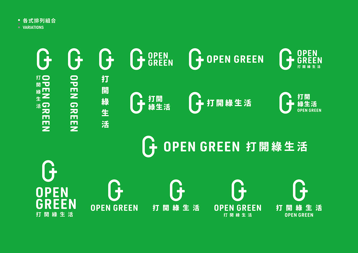
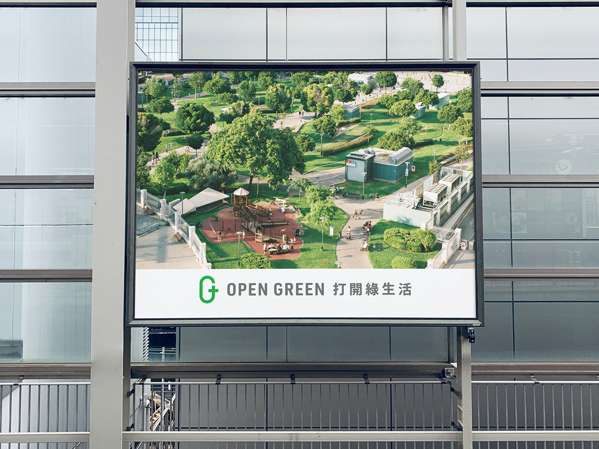
標誌視覺以 “OPEN GREEN” 的兩個字首 “O”、“G” 為基礎,還融合了 「開鎖、城市的醫生、升級、循環」等等元素在其中。
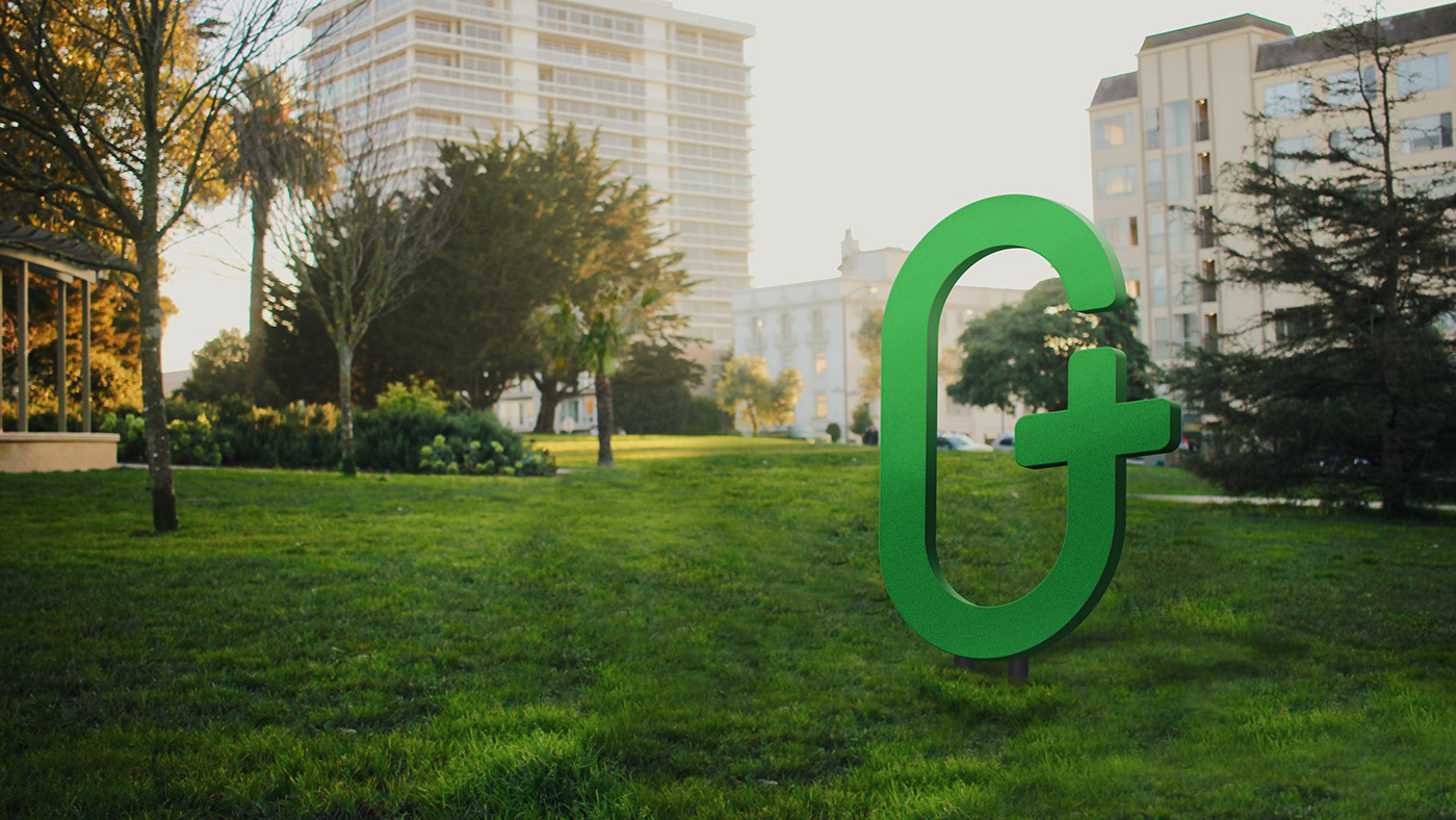
城市中未經整理的閒置場域,雜草叢生、蚊蟲環繞,彷彿上了鎖般, 令人避而遠之。右上角的開口,如同 OPEN GREEN 的意義,打開無形的鎖 鏈,解放那些曾被遺忘的空間。交叉的十字符號代表了醫療,而 OPEN GREEN 就像是個城市的醫生, 替老舊空間做醫治與診療;此十字符號另有「加號、提升、plus 」的意思,經過 OPEN GREEN 活化改造後,新空間有了整體的升級。 整體的橢圓造形也有循環、再生、永續經營的含義。
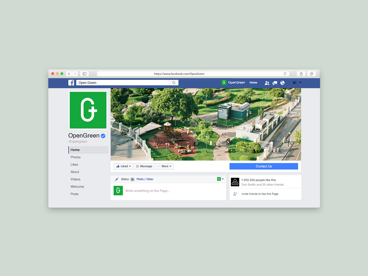
希望這個標誌於重新設計後,可以像個認證徽章一樣,豎立在每個改造過後的空間裡,藉此慢慢建立起屬於這個城市、居民、空間的品牌認同感。
*本作品為參加競賽未入選提案
This logomark is based on the initials "O" and "G" of "OPEN GREEN", and also incorporates elements such as "lock picking, city doctor, upgradation, ecocycling". Those desolate fields in the city, overgrown with weeds and surrounded by mosquitoes, are locked away. The notch in the upper right corner of the logo, as what OPEN GREEN implies, opens the invisible chain and liberates those forgotten Spaces. The cross symbol represents medical treatment. OPEN GREEN is like a city doctor who does medical treatment for the old spaces. This cross symbol also means “plus” and “upgradation". With OPEN GREEN’s activation and transformation, the new spaces has an overall upgrade. The oval shape also has the meaning of ecological circulation, regeneration and sustainable management. Through redesign, it is hoping that this logo could be erected like a certification badge in every reconstructed spaces, so as to gradually establish the brand identity of the city, residents and space.
*This proposal was not listed in the final competition.


打開綠生活 - 視覺識別 提案
OPEN GREEN - Visual Identity Proposal
-----
Design Agency | THE 90s LAB
Designer | Tan Yu-Chen


